Component · controls
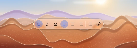
Liquid glass toolbar
Group of related actions.
Also called toggle group, action bar, format bar, bottom toolbar

Spec
- Material
- regular
- Profile
- squircle
- Geometry
- capsule 36–44 tall; items 28–32; 1 px separators between groups; optional inset field
- Bezel (px)
- 18–20
- Displacement (px)
- 30–40
- Blur (px)
- 2–4
Anatomy
- one glass capsule strip
- flat icon/text buttons
- active item solid accent or tint
- separators 1 px white 25 %
States
- rest
- item active
- item press
Rules
- The strip is the lens; items are flat — do not frost every glyph.
- Inset search field inside a toolbar is a darker flat trough, not a second lens.
- A top toolbar gets the same uniform scroll-edge band as the navigation bar once content scrolls under it; items that do not fit go into one overflow (…) menu at the trailing end.