Component · controls
Liquid glass input
Text entry.
Also called field, text field, textbox, otp field, fieldset, form, textarea
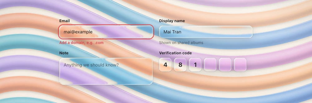
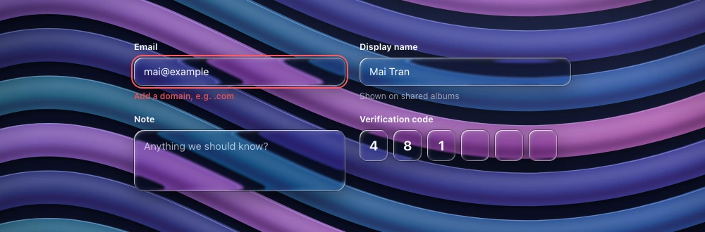
Spec
- Material
- regular trough (slightly darker than surrounding glass) · OTP: one rim/lens tile per digit
- Profile
- squircle
- Geometry
- height 36–44, radius 10–12 (or capsule), padding-x 12; label above 12–13 semibold; OTP slots 36–44 square, radius 10, gap 8
- Bezel (px)
- 12–16
- Displacement (px)
- 20–30
- Blur (px)
- 1–2
Anatomy
- glass trough
- placeholder secondary colour
- text primary
- helper text below
States
- rest
- focus: 2 px accent ring
- error: red ring + helper
- disabled
Rules
- A fieldset container stays clear; each field is its own glass.
- Inside a dialog the field is a flat trough, not a second lens.