Component · controls
Liquid glass icon button
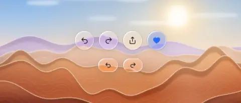
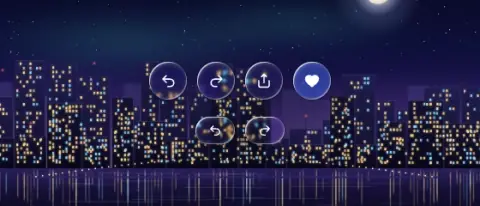
Single-icon actions: undo/redo chips, floating action, search button next to a tab bar.
- Material
- lens
- Profile
- convex (circle) or bevel (capsule chip)
- Bezel (px)
- radius (chip: h/2)
- Displacement (px)
- 0.5 × radius (circle) · 0.4 × bezel (chip)
- Blur (px)
- 0–1
Geometry. circle 32–44 (touch 44), or capsule chip 28–32 tall × 40–48 wide; icon 16–20. A search or action lens beside a floating bar takes the bar's height (56–64), as the tab-bar spec says
Rules2
- Space siblings ≥ 8 px so they read as separate lenses (or deliberately merge them with morph).
- Tooltips open 6–8 px above, never overlapping the button.
Anatomy2
- glass circle/capsule
- flat centred glyph
States3
- rest
- press: grow 1.06 + brighter glow
- active: tint
Questions
What material is a liquid glass icon button?
Lens material with a convex (circle) or bevel (capsule chip) edge profile, in the controls layer. Single-icon actions: undo/redo chips, floating action, search button next to a tab bar.
How big is a liquid glass icon button?
Circle 32–44 (touch 44), or capsule chip 28–32 tall × 40–48 wide; icon 16–20. A search or action lens beside a floating bar takes the bar's height (56–64), as the tab-bar spec says.
What bezel, displacement and blur does it use?
Bezel radius (chip: h/2); displacement 0.5 × radius (circle) · 0.4 × bezel (chip); blur 0–1 (px).
Which states does a liquid glass icon button need?
Rest; press: grow 1.06 + brighter glow; active: tint.