Component · controls (floating)
Liquid glass tab accessory
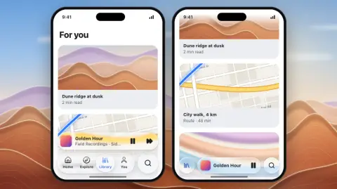
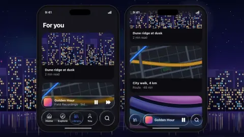
A persistent strip above the tab bar for one ongoing task: a mini player, a running timer, an upload in progress.
- Material
- regular
- Profile
- bevel
- Bezel (px)
- 18–22 (20 on a 52 strip)
- Displacement (px)
- 0.4 × bezel (8 at bezel 20)
- Blur (px)
- 2–6
Geometry. its own capsule 48–56 tall (52), as wide as the tab bar row it sits on (the bar plus its search lens), 8 px above the bar; a flat artwork tile 32–36 (34, radius 8) at an inset of 8–10, title 13–14 weight 600 over a subtitle 12, then 1–2 flat 36–40 px icon buttons (play/pause, next). Inline, once the bar collapses on scroll: 44–48 tall (48) between the collapsed tab circle and the search lens with 8 px gaps, artwork 28–30, title only, one button
Rules4
- A separate glass body 8 px above the bar: never a second row inside the tab bar, never touching it.
- As wide as the tab bar row in both states; it moves inline when the bar collapses and back above it when the bar expands, with a spring.
- Everything inside is flat: the artwork is an image tile and the buttons are glyphs; no lens on a lens.
- One accessory at a time. The scroll-edge band behind the bar reaches 16 px above the accessory so its title holds 4.5:1.
Anatomy4
- a glass capsule of its own, separate from the tab bar
- flat artwork tile (an image, never glass)
- title and subtitle, one line each, truncated
- 1–2 flat icon buttons with a hover/press fill (white 34 % / 10 %), no glass of their own
States4
- expanded: 8 px above the tab bar
- inline: the tab bar has collapsed to one circle holding the selected tab; the accessory sits between that circle and the search lens
- playing / paused
- tap: opens the full player, growing from the strip
Questions
What material is a liquid glass tab accessory?
Regular material with a bevel edge profile, in the controls (floating) layer. A persistent strip above the tab bar for one ongoing task: a mini player, a running timer, an upload in progress.
How big is a liquid glass tab accessory?
Its own capsule 48–56 tall (52), as wide as the tab bar row it sits on (the bar plus its search lens), 8 px above the bar; a flat artwork tile 32–36 (34, radius 8) at an inset of 8–10, title 13–14 weight 600 over a subtitle 12, then 1–2 flat 36–40 px icon buttons (play/pause, next). Inline, once the bar collapses on scroll: 44–48 tall (48) between the collapsed tab circle and the search lens with 8 px gaps, artwork 28–30, title only, one button.
What bezel, displacement and blur does it use?
Bezel 18–22 (20 on a 52 strip); displacement 0.4 × bezel (8 at bezel 20); blur 2–6 (px).
Which states does a liquid glass tab accessory need?
Expanded: 8 px above the tab bar; inline: the tab bar has collapsed to one circle holding the selected tab; the accessory sits between that circle and the search lens; playing / paused; tap: opens the full player, growing from the strip.