Home Components Menubar Component · controls
Liquid glass menubar Row of menus (desktop).
Also called menu bar
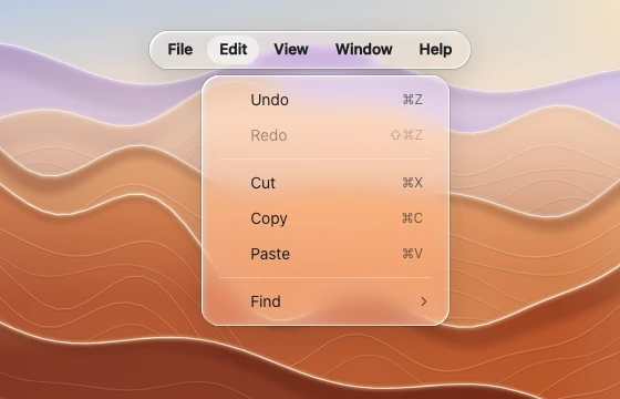
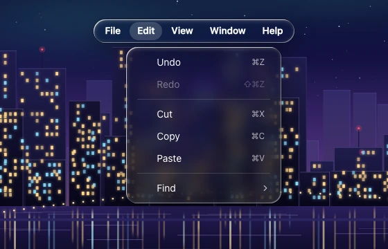
A desktop menu strip with one item open into a dropdown of shortcuts, dividers and disabled items, over zoomed desert ridges. (light) A desktop menu strip with one item open into a dropdown of shortcuts, dividers and disabled items, over a zoomed night skyline. (dark) Spec
Material regular
Profile squircle
Geometry capsule 32–36 tall, flat triggers File / Edit / View
Bezel (px) 16
Displacement (px) 30
Blur (px) 2–4 Anatomy one glass strip flat triggers menus open as separate lenses close below States rest trigger open: flat highlight pill Rules The strip is the lens; triggers flatten inside it. Popups sit closer (6 px) than free menus. Desktop only — on mobile use a tab bar or toolbar. Ask your assistant for it This spec is what the Meniscus MCP server's get_component_spec tool returns, with the reference images attached. Rules that apply to every component are in the liquid glass guide .
Prompt Design a menubar in liquid glass for <web | Figma | SwiftUI | Flutter | React Native>.
Use the meniscus tools: get_component_spec "menubar", then check the result against its rules.Connect Meniscus free More controls