Component · controls
Liquid glass button
Primary and secondary actions.
Also called btn, cta
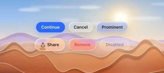
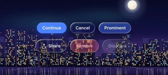
Spec
- Material
- lens (secondary) · solid accent (primary) · tint (prominent/danger variants)
- Profile
- squircle
- Geometry
- capsule, height 32–36 desktop / 44 touch, padding-x 16–20, radius h/2
- Bezel (px)
- h/2
- Displacement (px)
- 25–30
- Blur (px)
- 0.5–1
Anatomy
- glass capsule
- flat label 14–15 px weight 600 (or icon + label, gap 6)
States
- rest
- hover: rim +10 %
- press: scale 1.04, displacement +15 %
- focus: 2 px accent ring offset 2 px
- disabled: flat, 40 % content
Rules
- One solid accent (#2B6BFF) per group; siblings are glass.
- Variants: Glass (clear), Accent (blue tint), Danger. Danger is red tint for a destructive action that opens a confirmation (a Delete or Reset row or button), and solid red only for the action that confirms it in the dialog, as that group's one solid button (see dialog).
- Buttons inside a glass bar or dialog footer that is already glass: keep the dialog frosted and the buttons lens — they are separate bodies with gaps, not nested inside another lens's optics.