Component · controls
Liquid glass slider
Continuous value.
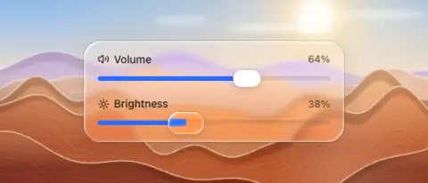

- Material
- track: flat glass groove · fill: solid accent · thumb: white capsule, clear lens while dragged
- Profile
- convex thumb
- Bezel (px)
- thumb h/2
- Displacement (px)
- 0.5 × thumb h/2 while dragged (convex, up to 0.6)
- Blur (px)
- 0
Geometry. track 6–8 tall, radius 4; thumb capsule 36×22 (iOS 26 style) or circle 22–28 — keep the thumb ≥ 3× the track height
Rules2
- Drag must change thickness/size, not only colour.
- Value label above right, secondary text colour.
Anatomy4
- label + value row
- track
- accent fill
- thumb
States3
- rest
- drag: thumb grows 1.2–1.4× and becomes clear glass magnifying the track
- disabled
Questions
What material is a liquid glass slider?
Track: flat glass groove · fill: solid accent · thumb: white capsule, clear lens while dragged material with a convex thumb edge profile, in the controls layer. Continuous value.
How big is a liquid glass slider?
Track 6–8 tall, radius 4; thumb capsule 36×22 (iOS 26 style) or circle 22–28 — keep the thumb ≥ 3× the track height.
What bezel, displacement and blur does it use?
Bezel thumb h/2; displacement 0.5 × thumb h/2 while dragged (convex, up to 0.6); blur 0 (px).
Which states does a liquid glass slider need?
Rest; drag: thumb grows 1.2–1.4× and becomes clear glass magnifying the track; disabled.