Component · controls
Liquid glass toggle
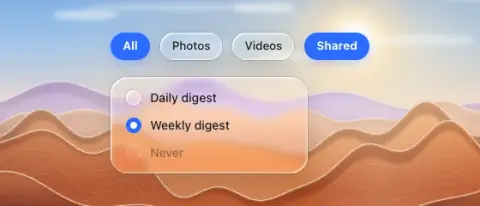
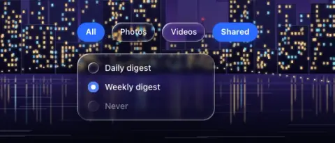
On/off toggle buttons and single-choice radios.
- Material
- lens (off) → solid accent or tint (on)
- Profile
- bevel
- Bezel (px)
- h/2
- Displacement (px)
- 0.4 × bezel (6.5 at 32 px)
- Blur (px)
- 0.5–1
Geometry. capsule like button; radios 16–18 px circles
Rules2
- On state must differ by colour AND weight/fill, not only rim brightness.
- Chips inside a sheet, bar or any other glass body are flat: a flat fill off (the flat chip token: white 52 % light, white 18 % dark), the accent tint with accent text or a solid accent on; no glass of their own.
Anatomy2
- glass capsule or small circle
- label
States3
- off: clear glass
- on: solid accent or tint
- disabled: tinted flat at 45 %
Questions
What material is a liquid glass toggle?
Lens (off) → solid accent or tint (on) material with a bevel edge profile, in the controls layer. On/off toggle buttons and single-choice radios.
How big is a liquid glass toggle?
Capsule like button; radios 16–18 px circles.
What bezel, displacement and blur does it use?
Bezel h/2; displacement 0.4 × bezel (6.5 at 32 px); blur 0.5–1 (px).
Which states does a liquid glass toggle need?
Off: clear glass; on: solid accent or tint; disabled: tinted flat at 45 %.