Component · controls (floating)
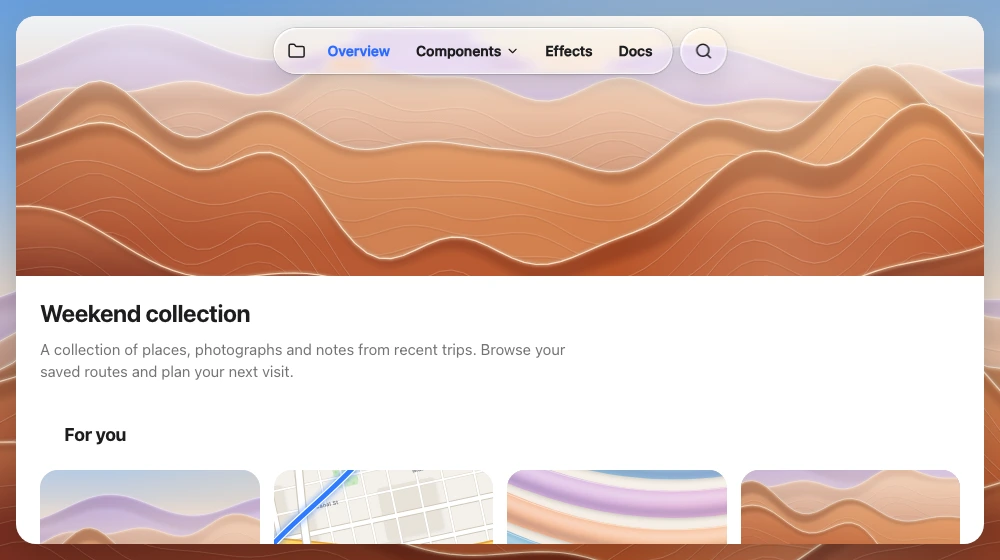
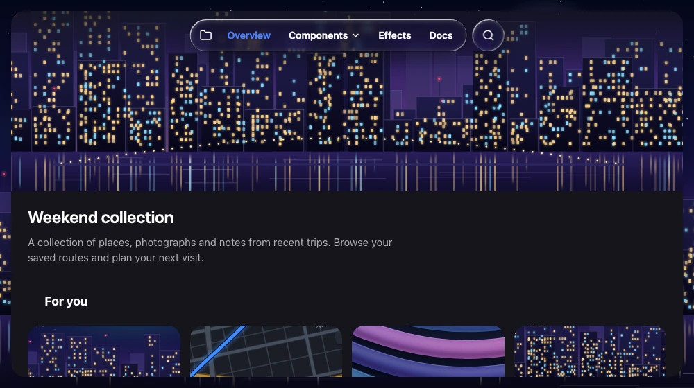
Liquid glass navigation bar
Top navigation / site nav strip.
Also called navigation menu, top bar, header, app bar, nav
Spec
- Material
- regular
- Profile
- squircle
- Geometry
- capsule 40–48 tall floating 8–12 below the top safe area; or iOS large title with glass buttons at the corners
- Bezel (px)
- 20
- Displacement (px)
- 35–40
- Blur (px)
- 2–6
Anatomy
- glass capsule
- flat items (text + chevrons)
- leading/trailing glass circle buttons
States
- rest
- item hover/press
- open submenu: separate glass popup 6–8 px below
Rules
- Scroll-edge fade where content passes under it.
- Once content has scrolled under, one uniform soft band spans the full width behind the bar items (bar height + 16–24, fading downward), not a halo per item.