Component · controls
Liquid glass search field
Search entry.
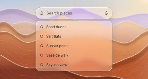
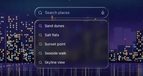
- Material
- regular
- Profile
- bevel
- Bezel (px)
- 18–20
- Displacement (px)
- 0.4 × bezel (7.5–8)
- Blur (px)
- 1–2
Geometry. capsule 36–44 tall with leading magnifier; to filter a list, inline above the rows it filters (below the title, scrolling with them or pinned under the bar); as app-wide search on iOS 26, at the bottom next to the tab bar or in a toolbar
Rules2
- Filtering a list needs no suggestion listbox: the rows below it are the results.
- Inside a sheet, bar or any other glass body it is flat content: a trough (the trough token: black 7 % light, black 28 % dark) with the same leading icon and trailing mic or clear, no glass of its own.
Anatomy4
- glass capsule
- leading icon
- placeholder
- optional trailing mic/clear
States3
- rest
- typing: trailing clear button
- focus (app-wide search): expands (morph) and shows suggestions in a separate glass listbox; without morph it simply widens
Questions
What material is a liquid glass search field?
Regular material with a bevel edge profile, in the controls layer. Search entry.
How big is a liquid glass search field?
Capsule 36–44 tall with leading magnifier; to filter a list, inline above the rows it filters (below the title, scrolling with them or pinned under the bar); as app-wide search on iOS 26, at the bottom next to the tab bar or in a toolbar.
What bezel, displacement and blur does it use?
Bezel 18–20; displacement 0.4 × bezel (7.5–8); blur 1–2 (px).
Which states does a liquid glass search field need?
Rest; typing: trailing clear button; focus (app-wide search): expands (morph) and shows suggestions in a separate glass listbox; without morph it simply widens.