Component · controls
Liquid glass checkbox
Multi-select.
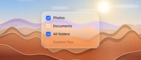
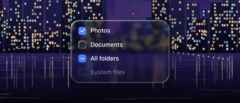
- Material
- unchecked: small lens/rim tile · checked: solid accent with white check
- Profile
- rim
- Bezel (px)
- 4–6 (= radius)
- Displacement (px)
- 0.15 × bezel (≤ 1 px)
- Blur (px)
- 0.5
Geometry. 16–18 px square, radius 5; group gap 10–12
Rules1
- Tiny controls barely show refraction; rim + fill carry them.
Anatomy3
- box
- check or dash glyph
- label
States4
- unchecked
- checked
- indeterminate (dash)
- disabled 40 %
Questions
What material is a liquid glass checkbox?
Unchecked: small lens/rim tile · checked: solid accent with white check material with a rim edge profile, in the controls layer. Multi-select.
How big is a liquid glass checkbox?
16–18 px square, radius 5; group gap 10–12.
What bezel, displacement and blur does it use?
Bezel 4–6 (= radius); displacement 0.15 × bezel (≤ 1 px); blur 0.5 (px).
Which states does a liquid glass checkbox need?
Unchecked; checked; indeterminate (dash); disabled 40 %.