Accent material
Liquid metal
Opaque, mirror-polished metal that behaves like liquid. It shows nothing of the backdrop; it reflects a simple studio environment as a few broad bands (a white highlight, a thin dark line, a long ramp into near-black) that flow across the shape and bend where the surface turns away at the silhouette. Where a dark band meets a light one there is often a 1–3 px red/blue fringe (dispersion). In UI it appears as a chrome rim or ring on one control, or as a whole icon or logo mark.
Also called liquid chrome, chrome metal, metal, metallic, mercury, molten metal, polished metal
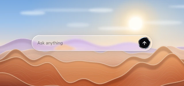

Where to use it
- Use in
- Accent only, at most one element per view: logo and brand marks, app icons, the rim of a hero or primary action, the ring of the selected item in a bar, an assistant or voice trigger. It is not a glass material: on a glass interface it replaces the specular rim of that one element, and bars, panels and the other controls stay glass.
- Avoid
- Metal fills on bars, panels, sheets or anything that carries text; several metal elements competing in one view; a glass body with a metal face (one material per body); fringes wider than 3 px on controls; bands streaming constantly behind reading content; metal letterforms under 24 px, where the bands break up the glyphs.
Parameters
rim 2–4 px on controls (1.5–2 px under 32 px tall), ring 3–5 px around a selected tile or round button; 2–2.5 bands across a rim, 1.2–1.6 across a filled icon or mark; band edges 2–3 % soft; highlight #F7F8FC, dark #14151A, optional cool tint ≤ 10 %; red/blue channel shift 0 (calm) or 0.2–0.35 on controls (1–3 px fringe), up to 0.6 on logo marks; motion one slow drift of 8–15 s per band, or tied to pointer or scroll, frozen under reduced motion.
How it is built
- Design tool
- Paper: Liquid Metal fill on the shape (for a rim, on a ring shape) or on an uploaded transparent logo; repetition 2, softness 0.1, shiftRed / shiftBlue 0.3 (0 for a calm version), distortion 0.05–0.1, contour 0.4. Figma and tools without a shader: inside stroke 2–4 px with an angular gradient of hard stops #14151A 0–7 %, #F7F8FC 10–21 %, #8A8D96 30 %, #FFFFFF 43–47 %, #2A2B30 51–59 %, #D9DBE2 70 %, #14151A 81 %, #F7F8FC 92 %; fringes: two copies of the stroke tinted #FF3B30 and #2F7BFF, offset ±1 px, blend Screen, masked to short segments where a dark stop meets a light one.
- Web
- WebGL fragment shader drawn over the element on a canvas, keeping only the rim band or the whole mark (liquidMetal in the web recipe), or the Paper Shaders LiquidMetal React component. Static fallback: a conic-gradient ring with the same hard stops, masked to the border box, without fringes. Nothing behind is sampled, so there is no backdrop-filter.
s = dot(p, dir) * 0.5 + 0.35 * edge² + 0.08 * noise(p + t); s = s * bands − 0.08 t; k = shift * 0.05 * (0.4 + edge); col = mix(dark, light, vec3(band(fract(s + k)), band(fract(s)), band(fract(s − 1.3 k)))); alpha = the shape or rim mask; no backdrop sample.