Effect
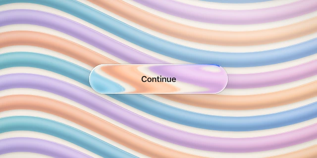
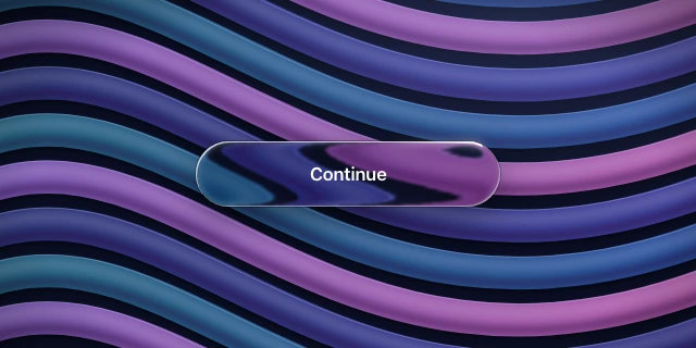
Liquid glass border beam
A short arc of light travels along the silhouette at one constant speed: a bright head as thin as the rim (1–2 px, white or accent) fading to nothing along a tail of 15–35 % of the perimeter, wrapping corners and caps without changing width, length or speed. It rides on top of the static directional rim, often with a soft bloom around the head. Variants: twin beams half a lap apart; a diffuse gradient drifting around the whole border (shine border); a blurred glow blob instead of a crisp line (moving border).
Also called beam, moving border, border trail, shine border, light beam, running light, animated border, border light, glow border, comet border
Where to use it
- Use in
- Accent only, at most one beamed element per view: the primary call to action of a landing hero, a featured card or pricing plan, an upgrade or new badge, or a surface that is working (assistant thinking, recording, uploading), where the beam means activity and stops when the work ends.
- Avoid
- Beams on several elements, everyday controls, bars or navigation; driving the beam by angle (a rotating conic or angular gradient) on shapes wider than about 1.5 : 1, where it crawls mid-edge and races and stretches around the caps; laps under 3 s, easing or back-and-forth motion; rings thicker than 2 px or neon glows; replacing the directional rim with the beam; letting the optic refract the beam; a white beam on light glass, where it vanishes into the rim; any beam under reduced motion.
Parameters
width = rim width (1 px; 1.5 px on panels ≥ 400 px; 2 px max); tail 15–35 % of the perimeter (≈ 1.5 × the height on a capsule button, 120–200 px on a card); head white 90–100 % on dark glass, accent #2B6BFF on light glass, tail fading to 0 (optionally head colour → second colour → transparent); lap 4–6 s on buttons, 6–10 s on cards, 2–3 s for a working state, linear, constant speed along the outline; bloom: the same beam twice as wide, blurred 3–4 px, 50–80 %; twin beams 50 % apart; reduced motion: no beam.
How it is built
- Design tool
- Stills: duplicate the outline, give it a 1.5 px inside stroke with a gradient from the head colour to transparent and mask it to a 20–30 % stretch of the outline; a 4 px layer-blur copy underneath is the bloom. Motion: Trim Paths on the outline in After Effects, Lottie or Rive (end = start + tail, offset animated 0 → 100 %, linear) is the exact constant-speed beam. Figma Smart Animate can only rotate a masked angular gradient, which is acceptable on near-square cards only. Hand off width, tail %, lap, colours and bloom.
- Web
- Tier A (Chrome 116, Safari 18, Firefox 122): a ring layer above the rim (padding = beam width, masked with mask-composite: exclude) holding one streak that travels offset-path: inset(0 round <radius>) with offset-distance 0 → 100 % linear; the streak is a square as long as the tail with a gradient toward its leading edge, turned by the path. Streak ≤ 1.5 × the shorter side; longer tails on thin shapes: a comet of 10–16 lagging segments. Bloom: the same ring 3 px wide inside a blur(4px) wrapper.
behind = fract(t / lap − rimPos(p)); beam = (1 − clamp(behind / tail, 0, 1))² × ring(sdf, width); rimPos = arc length of the nearest outline point (0–1), quarter picked by the signs of p − clamp(p, −s, s); add beam × colour above the rim, below content.