Component · overlay
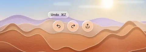
Liquid glass tooltip
Short label for a control.

- Material
- tint or regular
- Profile
- bevel
- Bezel (px)
- 12
- Displacement (px)
- 0.4 × bezel (5)
- Blur (px)
- 1–2
Geometry. capsule 24–28 tall, text 12 px, 6–8 px above the control
Rules1
- Never overlaps its control.
Anatomy2
- small glass capsule
- text + shortcut (e.g. Undo — ⌘Z)
States2
- hidden
- shown after 400–600 ms
Questions
What material is a liquid glass tooltip?
Tint or regular material with a bevel edge profile, in the overlay layer. Short label for a control.
How big is a liquid glass tooltip?
Capsule 24–28 tall, text 12 px, 6–8 px above the control.
What bezel, displacement and blur does it use?
Bezel 12; displacement 0.4 × bezel (5); blur 1–2 (px).
Which states does a liquid glass tooltip need?
Hidden; shown after 400–600 ms.