Component · overlay (modal)
Liquid glass dialog
Blocking decision or form.
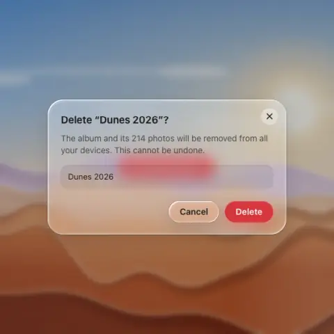
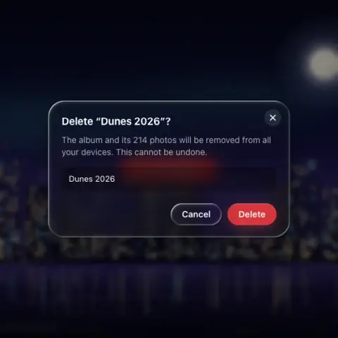
- Material
- frost
- Profile
- bevel
- Bezel (px)
- 26–28 (= radius)
- Displacement (px)
- 0.4 × bezel (10.5–11)
- Blur (px)
- 10–18
Geometry. radius 24–28, width 320–420, padding 20–24; actions right-aligned capsules
Rules2
- The rim must stay readable against the dim.
- Destructive primary is solid red; only one solid button.
Anatomy6
- dim + blur the world (black 25 % light / 45 % dark, 2–6 px blur)
- frosted panel
- title 15–17 semibold, body secondary
- inputs as flat troughs (darker fill, no optics of their own)
- actions: glass Cancel + solid accent (or solid red for destructive)
- corner close glyph stays flat
States2
- open: scale 0.94 → 1 + fade
- closing
Questions
What material is a liquid glass dialog?
Frost material with a bevel edge profile, in the overlay (modal) layer. Blocking decision or form.
How big is a liquid glass dialog?
Radius 24–28, width 320–420, padding 20–24; actions right-aligned capsules.
What bezel, displacement and blur does it use?
Bezel 26–28 (= radius); displacement 0.4 × bezel (10.5–11); blur 10–18 (px).
Which states does a liquid glass dialog need?
Open: scale 0.94 → 1 + fade; closing.