Home Components Menu Component · overlay
Liquid glass menu Command list opened from a trigger.
Also called dropdown, dropdown menu, action menu
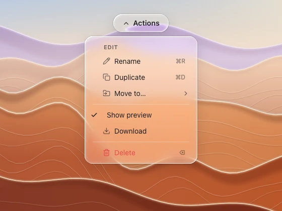
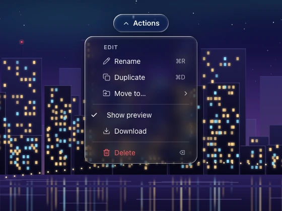
An action menu hanging below its capsule trigger, with icons, shortcuts, dividers and a destructive row, over zoomed desert ridges. (light) An action menu hanging below its capsule trigger, with icons, shortcuts, dividers and a destructive row, over a zoomed night skyline. (dark) Spec
Material frost (long) · regular (short)
Profile squircle
Geometry radius 14–18, min-width 200, rows 30–34, padding 6, separators 1 px, section labels 11 px caps
Bezel (px) 18
Displacement (px) 35–45
Blur (px) 8–14 Anatomy glass panel flat rows (label, shortcut right-aligned secondary) checked items ✓ destructive row red text submenu chevron States closed open: grows from the trigger (0.92 → 1) row highlight: flat tint pill disabled 40 % Rules Trigger and popup are two lenses kept apart: 6–8 px gap. Rows are flat; only the panel refracts. Ask your assistant for it This spec is what the Meniscus MCP server's get_component_spec tool returns, with the reference images attached. Rules that apply to every component are in the liquid glass guide .
Prompt Design a menu in liquid glass for <web | Figma | SwiftUI | Flutter | React Native>.
Use the meniscus tools: get_component_spec "menu", then check the result against its rules.Connect Meniscus free More overlays