Component · content (inside a glass container or under glass chrome)
Liquid glass list
Scrolling rows of content.
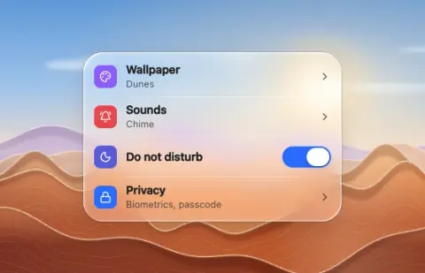
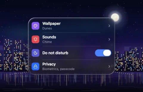
- Material
- flat rows
- Profile
- flat
- Bezel (px)
- 0
- Displacement (px)
- 0
- Blur (px)
- 0
Geometry. rows 44–56 (touch) / 32–36 (desktop); a grouped list sits in a glass card (radius 16–24, rows flush with its padding, separators inset past the icon)
Rules1
- Rows are flat; a list inside a glass card is not glass-on-glass as long as rows have no own optics.
Anatomy3
- rows with leading icon tile, title, secondary, trailing chevron/switch
- 1 px separators white 25 %
- capsule scroll thumb on hover
States3
- rest
- row press: flat tint
- selected
Questions
What material is a liquid glass list?
Flat rows material with a flat edge profile, in the content (inside a glass container or under glass chrome) layer. Scrolling rows of content.
How big is a liquid glass list?
Rows 44–56 (touch) / 32–36 (desktop); a grouped list sits in a glass card (radius 16–24, rows flush with its padding, separators inset past the icon).
What bezel, displacement and blur does it use?
Bezel 0; displacement 0; blur 0 (px).
Which states does a liquid glass list need?
Rest; row press: flat tint; selected.