Component · content on controls
Liquid glass badge
Count or status.
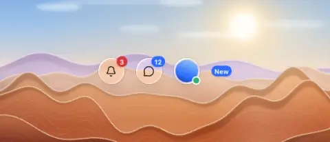
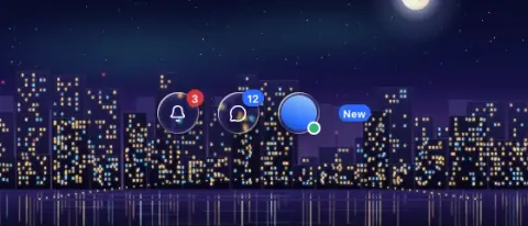
- Material
- solid (red #D6363B or accent #2B6BFF under the white count) — not glass
- Profile
- flat
- Bezel (px)
- 0
- Displacement (px)
- 0
- Blur (px)
- 0
Geometry. 16–18 tall capsule, 10–11 px bold white
Rules1
- Sits on the glass item corner; must look attached (overlap the icon by ~30 %), not a floating sticker.
Anatomy2
- solid capsule
- number
States1
- rest
Questions
What material is a liquid glass badge?
Solid (red #D6363B or accent #2B6BFF under the white count) — not glass material with a flat edge profile, in the content on controls layer. Count or status.
How big is a liquid glass badge?
16–18 tall capsule, 10–11 px bold white.
What bezel, displacement and blur does it use?
Bezel 0; displacement 0; blur 0 (px).
Which states does a liquid glass badge need?
Rest.